Lead generation with AI
Artificial intelligence can make lead generation more precise, faster, and more profitable. Find out here how AI improves your processes from data collection to conversion.

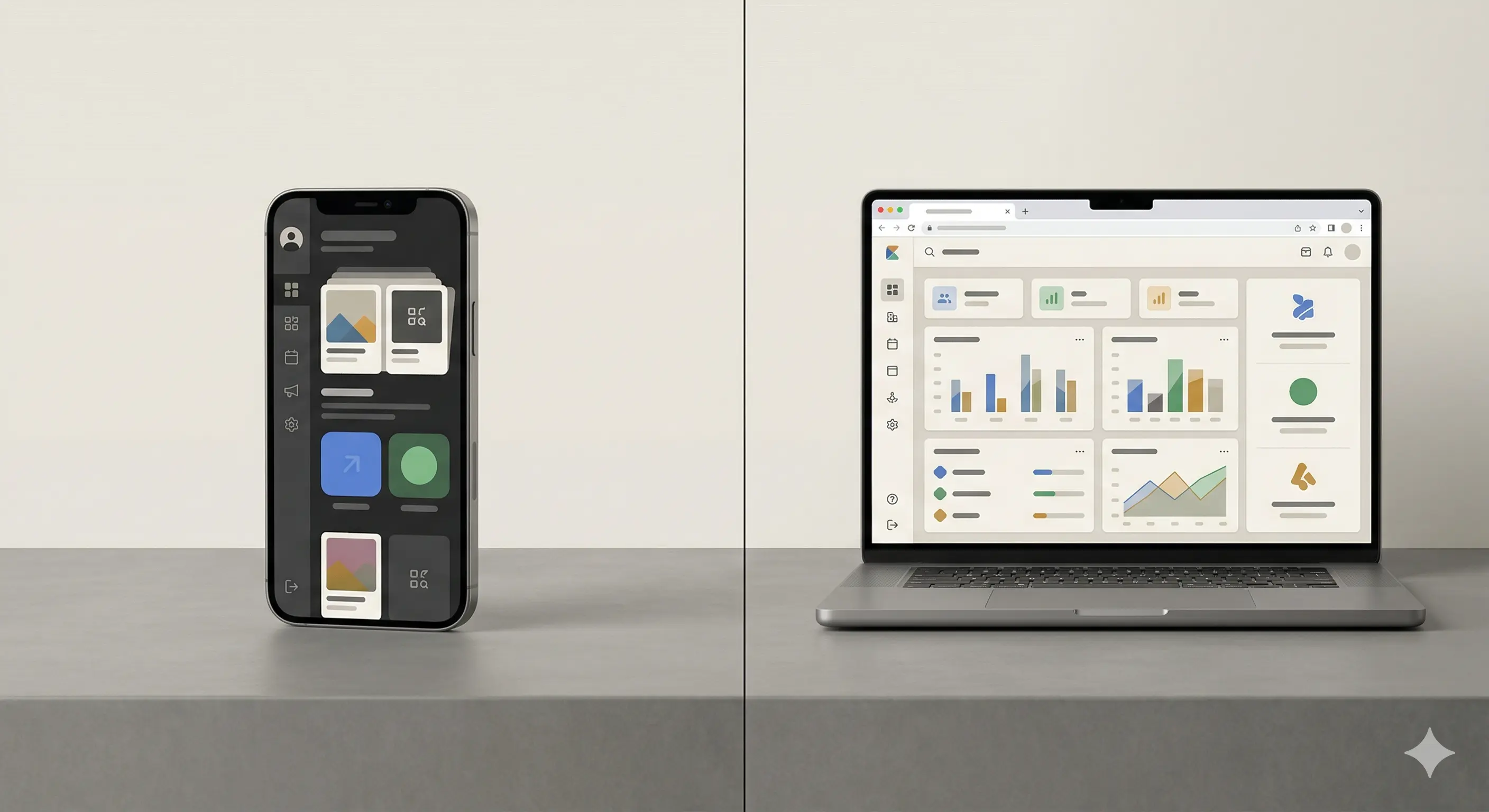
The way websites are designed and developed has changed radically in recent years. While the classic desktop approach used to be the rule, the mobile-first approach has established itself as a serious alternative with the smartphone boom at the latest. But what does that mean specifically for your website, your users — and ultimately for the success of your digital project? In this article, we'll take a practical look at both strategies, their areas of application, and how to get started right.
In the mobile-first principle, the mobile version of a website is chosen as the starting point for design and development. Only then is the layout extended for larger displays such as tablets and desktops. This method forces us to focus on the essentials: Content, functions and user guidance are designed in a very small space.
That sounds like a limitation at first, but in reality it's often an advantage. Because smartphones are no longer just everyday companions — they are the primary gateway to the Internet for many people. Studies show that over 60 percent of web traffic today comes from mobile devices. So if you don't optimize your website for small displays, you run the risk of alienating the majority of your users.
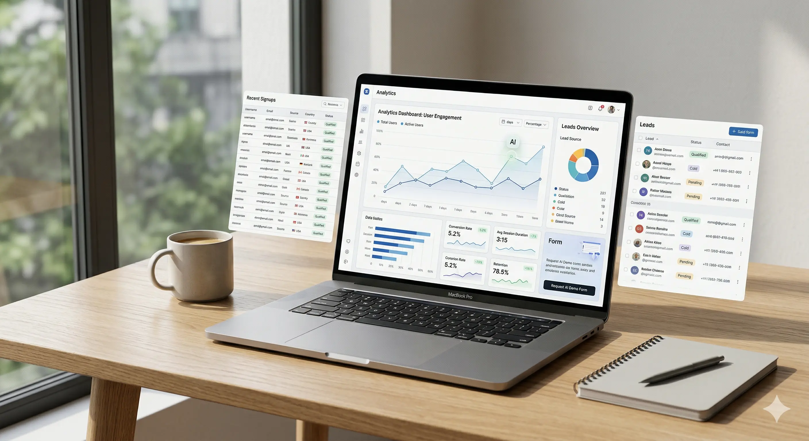
Even though mobile-first has become more important, the desktop-first approach remains relevant in certain contexts. Especially for applications with complex interfaces, extensive tables or data-driven dashboards, the larger screen still offers clear advantages. Here, the desktop version is developed first, and the mobile view is then adapted — often by reducing or simplifying.
This approach is efficient for many B2B applications, internal tools, or e-commerce systems with a high level of functionality. However, the prerequisite is that you have a well-thought-out strategy for mobile optimization — because simply “squeezing” the desktop version is not enough to make a good user experience to ensure on mobile devices.
The choice between mobile-first and desktop-first is closely related to how and where your users interact with your website. Is it about impulse purchases or complex configurations? You should answer this question clearly before you choose a side.
A common mistake is making a decision too early without analyzing specific user behavior. You should definitely evaluate how your target group is acting — and which devices dominate. Not only does gut feeling help you do this, but also a closer look at your analytics data.
This is where Techwerk offers valuable support, for example in the systematic evaluation of user behavior and the development of tailor-made strategies for different devices — even though this should not be the focus here.
One of the biggest benefits of mobile-first is performance optimization. If you are forced to prioritize content for small displays, you automatically reduce unnecessary ballast. This not only has a positive effect on loading speed, but also improves Core Web Vitals — a factor that Google has been taking into account for a long time in the ranking.
Loading times are no longer a sideshow, but decisive for user experience and conversion rate. Even a delay of one second can cause users to drop out. Mobile-First forces developers to work particularly lean and focused — a quality feature that also benefits the desktop version.
A structured approach such as is often used in the Techwerk environment lays the foundation here: Clearly prioritized content, optimized media elements, asynchronous loading and intelligent asset management have long been part of the standard of good web development.
When you're looking at mobile-first or desktop-first, talking about design philosophy isn't enough. Technical implementation also plays a central role. Basically, there are three common approaches:
Mobile-only:
A reduced version that is only optimized for mobile devices — usually used for simple landing pages or microservices. Not suitable for larger projects.
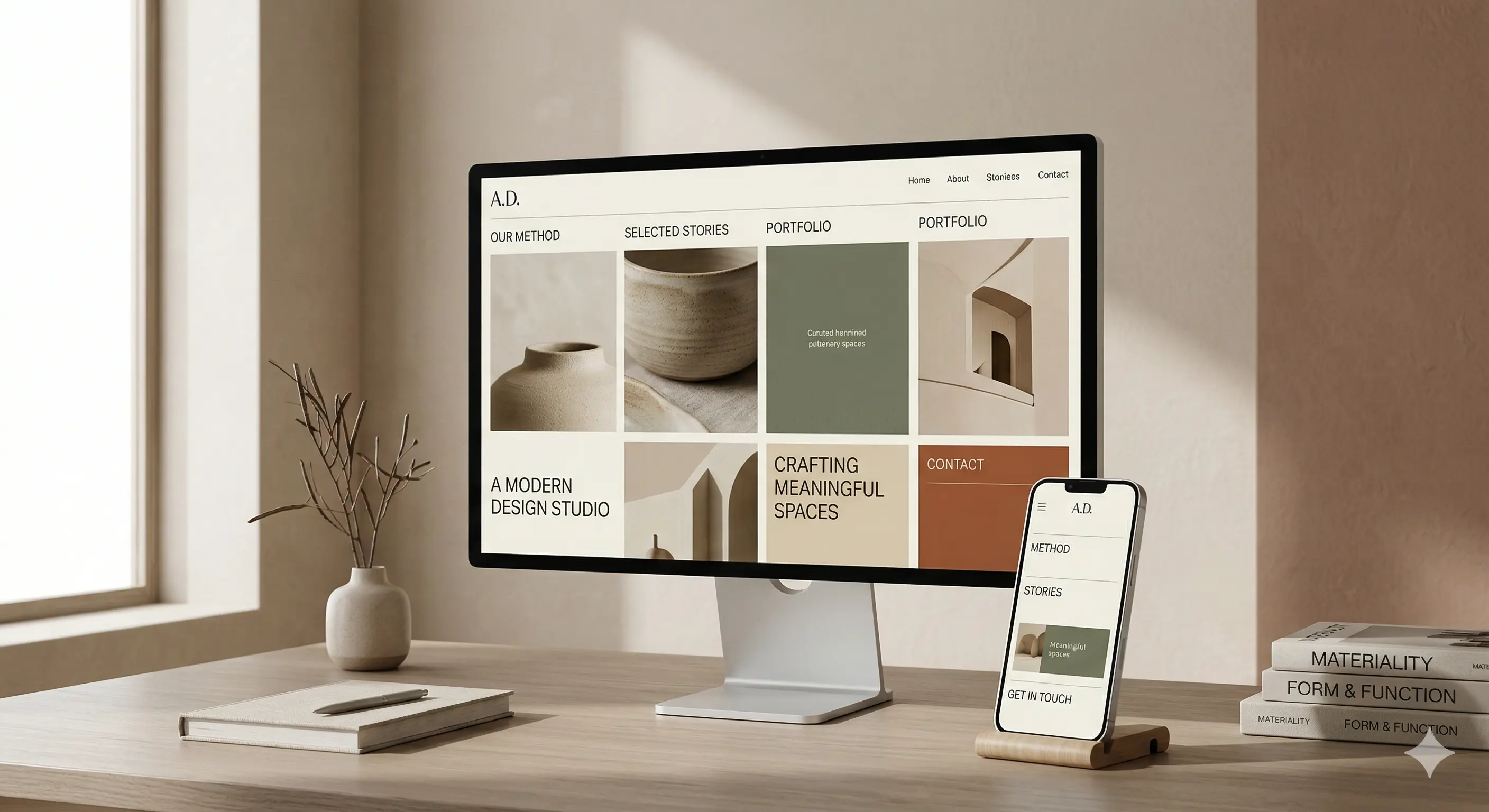
Responsive design:
A layout that adapts smoothly to the respective screen size. Content and functions are retained, and the design reacts dynamically to the device. That is standard today.
Adaptive design:
Several fixed layout variants are defined, which are loaded depending on the device. More complex in development, but sometimes useful for highly divergent target groups.
Depending on which philosophy you choose, there will be different challenges during the course of the project. You should therefore define early on whether a responsive layout is sufficient or whether an adaptive approach is better suited to your requirements.
One aspect that is often overlooked is the strategic orientation of the website in terms of visibility and goal achievement. For several years now, Google has primarily indexed the mobile version of a page (“mobile-first indexing”). If mistakes happen here, the ranking — and with it your visibility — suffers.
At the same time, you need to keep an eye on your conversion goals. Space on smartphones is limited — CTA buttons must be immediately visible and intuitive to use, forms must be kept as short as possible. At the same time, the range of functions must not suffer as a result of the mobile strategy. A good balance of clarity, functionality and design is crucial.
If you are looking for a scalable solution that not only focuses on one type of device but is flexible and future-proof, you should reconcile all technical and strategic adjustments. This is exactly where an experienced partner can help you without them having to come to the forefront of a blog article.
As described, there is no general answer to the question of which approach is better. It's more about what requirements your website must meet, who your users are, and how they interact with your content.
If your users are mostly mobile, content needs to be captured quickly and it's primarily about conversion, there's a lot to be said for mobile-first. For more complex applications that require intensive user interaction or large amounts of data, a desktop-first approach may be more appropriate — as long as you don't neglect the mobile version.
From custom software to powerful marketing, we empower your business with innovative technology and strategic design.
We have received your request and will get back to you within 24 hours at the latest with an answer